


vancouverbucsfan
-
Posts
165 -
Joined
-
Last visited
Content Type
Profiles
Forums
Events
Blogs
Gallery
Everything posted by vancouverbucsfan
-
Appreciate your feedback, everyone is human and entitled to an opinion so I respect yours, thx. Don't comprehend the 'beer league' theory behind your thinking?!?! Or it is too cartoon looking perhaps? The Penguins and the Ducks ones are just as cartoonish and the Islanders had a fisherman on their jersey at one time. Having worn it while out grocery shopping at the Burnaby Cotsco yesterday I had a lot of folks compliment me on the jersey saying they despised the 'regional orca whale logo" and thought this had been a good idea had the team done something different like a Johnny Canuck jersey. Being a 'retro' jersey this is what they should have considered. The retro they did with the orca makes it look like a sprite can jersey! Putting a Johnny Canuck logo on it had made more sense but seeing Aquaman loves his whale logo nothing is gonna change anytime soon. As well the southern resident killer whale is on the US endangered species list and can possibly become extinct one day soon.

-
-
Put Johnny Canuck on one PLEASE finally Aquaman!
-
 Worn mine yesterday while shopping at the Burnaby Cotsco and the feedback I got was everyone loved this look! Majority of the folks I spoke with regarding the jersey hate the orca and have said as well the southern resident killer whale along our coast are on the US endangered species list. Interesting, I wasn't even aware but googled it and yes sure enough the orca whale numbers along our coastal waters have greatly diminished. Team should have gone with this as a 'retro' jersey even if it was only worn for 10 games a season! Something different and judging buy everyone I bumped into yesterday grocery shopping they said it was an awesome look!
-
When will the Canucks win the Stanley Cup?
vancouverbucsfan replied to fanfor42's topic in Canucks Talk
Yes and they at least have one of these and we are still trying to get one 50 plus seasons later.
-
When will the Canucks win the Stanley Cup?
vancouverbucsfan replied to fanfor42's topic in Canucks Talk
Never as long as Aquaman owns the team!
-
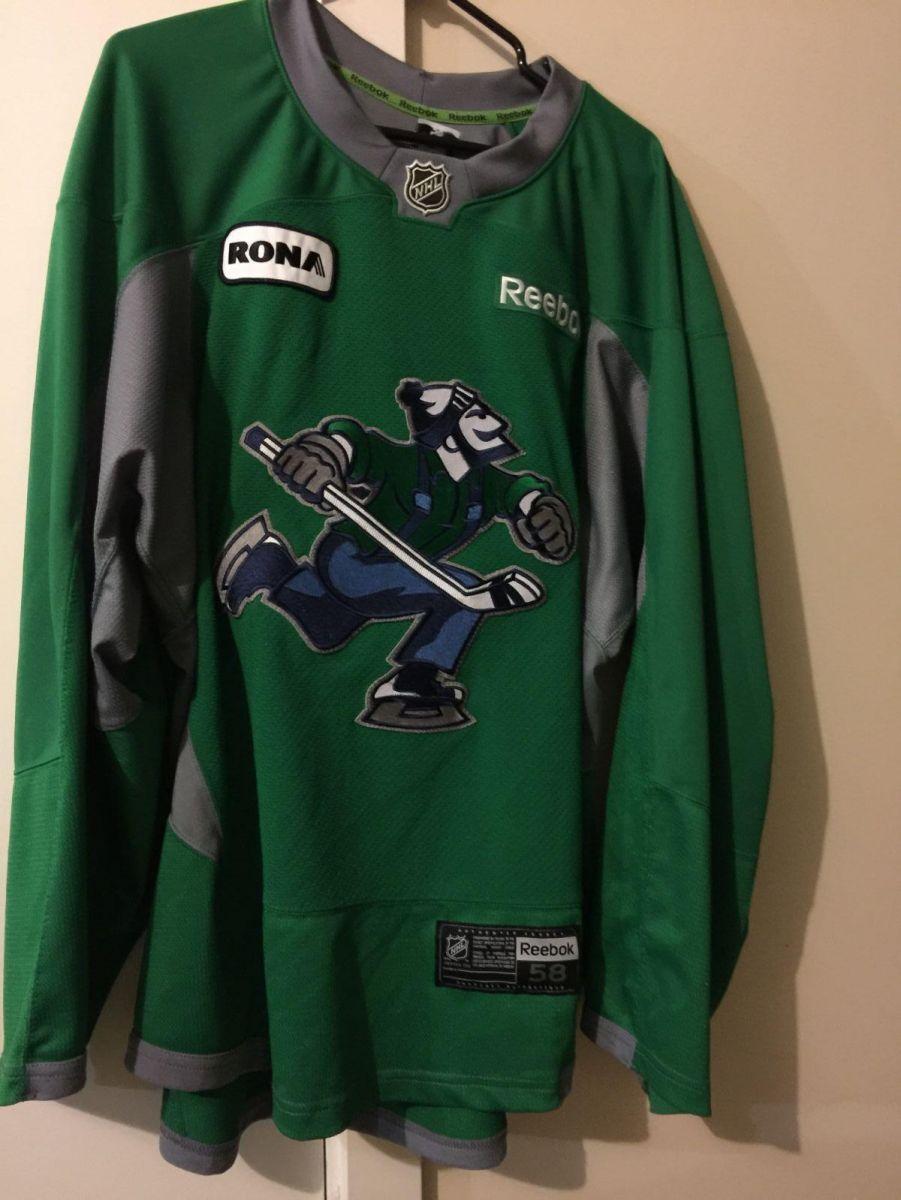
Me too but seeing the orca isn't glued to the jersey and stitched on I had it removed and put a Johnny Canuck logo crest on mine and voila, looks awesome and better than the ridiculous regional orca logo SMH! One figures it being a 'retro jersey' then perhaps the team should have done something retro related! Buy the way the southern resident killer whales(google search that) are on the US endangered species list so we don't have an abundance of killer whales residing off our coastal waters any longer!
-
Mission accomplished! Buy the way all you orca logo lovers if you google search the southern resident killer whales that reside off of our coast the whale is currently on the US endangered species list! Will be proudly wearing this as an alternate third jersey when the pandemic ends and we can finally start going to Canucks games once again! Me being a long time 11 game yearly ice pack holder of the team will be wearing this at Rogers Arena and around town and I'm quite sure I'll get a lot of positive comments regarding the jersey! Being a 'retro' jersey it'd have made sense had they gone with this look as something different and that would sell well. Later haters!
-
Mine looks a lot better without that ridiculous constipated looking orca! As well the southern resident killer whale(google it) is on the US endangered species list buy the way so there isn't an abundance of killer whales off of our coasts any longer. Will proudly be wearing my custom made Johnny Canuck alternate jersey around town and I'm quite sure the response will be positive! Cheers haters!
-
As an alternate third jersey it'd have made sense. The kids love Johnny Canuck and a lot of us adults do to. Even had they just do it as an alternate jersey for say ten games a season. You don't think this jersey looks sharp and wouldn't have sold? I'd have lined up to buy one had they gone with this and so would a lot of Canuck fans. The team can do whatever they want with their primary but do a Johnny Canuck one so everyone can be pleased as I see we Canuck fans aren't all in agreement on a proper logo and it isn't going to end anytime soon. I don't know what is so 'beer league' looking about it or junior team as you imply? In my US travels to go watch the Canucks play in Vegas, Arizona, etc. I have usually worn my green Johnny Canuck jersey and I've had other teams fans come up and ask me about the jersey that they have never seen it before. They tell me tell your team to throw it on a jersey and we'd buy one. The team should just do one to please those fans especially the little kids that like the Johnny Canuck logo. I mean you already see Johnny Canuck on a lot of the teams merchandise and it sells well so wouldn't it make sense to finally put it on a jersey already? In 2011 at the teams superskills competition they wore a Johnny Canuck practice jersey and people bought them up game worn practice worn right afterwards. Sold all of them out no problem. So do one finally and it'll please everyone that would like to see one done.
-
That's because they have never had a proper logo or identity from the get go. Look at the knights and the new Seattle logos. Both winners and top selling merchandise the past years. The orca makes no sense whatsoever. The team is named after a fictional lumberjack. The whale reminds us of their past mistakes like the Messier signing(worse free agent pick up!) Gretzky getting shafted but the previous owner when he was gonna sign a contract the following morning via Pat Quinn to center Mogilny and Bure, Bert clubbing Steve Moore, etc, needs to go now finally. Out of here, later haters!
-
He has since retired his new goalie mask and has apologized to all the snowflakes that were offended!
-
That Aquaman as owner will never get one of these! Lmao!
-
I'm offended! Lol!
-
And do a Johnny Canuck one too now finally! Lots of kids like Johnny Canuck and quite a few of us adults too! I'd have lined up to have bought one of these had the team decided to do their retro ones in it. And please don't give me the BS it's too beer league looking, etc. Even if it is 10 games a season in it. The Ducks alternate one is just as bad as you hating on the Johnny one so why not? The islanders should have put the Captain highliner one on their retro jerseys too!
-
Maybe someone is going to find the team name offensive(Canuck) as it can be used in an offensive way like our US neighbors referring to us as "dumb canucks"! Getting off topic though but one never knows now just saying if this native is that put off at the logo of the team then perhaps someone might get 'offended' buy the team name and petition Aquaman to now change it. Was only a matter of time that I figured this was going to happen seeing no more Aunt Jemima and the good ole KFC colonel himself. LMAO! Well then change their team name to the Vancouver Orcas now! You can be sure that Aquaman is ignoring this native individual unless he is protesting at a antimask christmas rally! Then he might get a tweet saying his tickets have been revoked! We find the word 'canuck' as offensive!!! LMAO! Later!
-
-
Canucks reveal new jerseys for 50th season
vancouverbucsfan replied to -Vintage Canuck-'s topic in Canucks Talk
drop.mp4 that's all folks!.mp4
-
Canucks reveal new jerseys for 50th season
vancouverbucsfan replied to -Vintage Canuck-'s topic in Canucks Talk
beautiful.mp4
-
-
Could have been a good alternate third jersey worn ten games a year for the 50th season this past season had the clubs marketing department had some imagination and creativity but I know all you haters will just comment 'too beer league looking"! I was at the draft here in Vancouver and it'd have been cool to have seen the team draft Podkozlin 10th overall and put a Johnny Canuck new third jersey on him in front of the fans in attendance and the millions watching on TV. It'd have sold well as the kids love Johnny Canuck and one sees it on a lot of the teams merchandise so why didn't the team do a jersey in it? So I rest my case! No worse than the Islanders Captain Highliner fish sticks jersey they wore for 2 seasons! Later haters, go ahead and flame away with your comments for or against the jersey. I only come around here every once in a blue moon to read the stuff so whatever.
-
-
Was sent an email buy them telling us we have to wait at least 30 days past the event before they issue a refund.
-
Canucks reveal new jerseys for 50th season
vancouverbucsfan replied to -Vintage Canuck-'s topic in Canucks Talk
keep trolling there you and all the other haters. No need to post a photo of it as I have already posted ones of the players in them. And you'd say the guy is an 'old geezer' or come up with some other vitriol remark about him wearing it so no point. You probably never attend any games live either to see fans wearing the green JC jersey or the fellow whom I mentioned wearing the Raymond jersey that was worn at the 2011 superskills competition, later, am done arguing with all of you. Being a long time yearly ice pack holder the team needed something new and different to kick start the lacking fan interest, etc. Even had they gone with this as an alternate jersey it'd have still been a success. The current rebrand big deal! Took "VANCOUVER" off the front of the jersey and kept the same ridiculous orca whale, enlarged it a bit, like BIG DEAL! And the new green they've gone with please don't even get me started on that! Totally ugly. Boring and no creativity whatsoever! Done arguing with all of you haters of the JC logo so if you wish to respond go right ahead as I won't even be coming back to read it. Enjoy the season and as my saying goes for the team 'hope for the best, expect the worse"! Just like the new supposed dull unimaginative rebrand the team has done.
-
Canucks reveal new jerseys for 50th season
vancouverbucsfan replied to -Vintage Canuck-'s topic in Canucks Talk
Baggins please stick to watching your Premier League english soccer as it is as dull and boring as our constipated looking orca whale!


.png.ec7add635af2adde635b1d41e57f6791.png)
.JPG.4e695a1a0357129c33f7311804a9f741.JPG)


.jpg.1e001146d6d4e71bd82508a60290c121.jpg)
.jpg.3732a914b7881007678f3ea84689952d.jpg)
.jpg.a9a9aad03ddbf87fe7aa06f6421ca73f.jpg)


